The Latest
Related Blog Posts


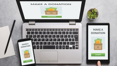
One of the most critical components of a GivingTuesday campaign is the giving experience itself. So as you’re developing your campaign, make sure to focus on where your giving takes place: your donation page.
A clear and easy-to-use donation page can be the difference between a visitor abandoning ship or helping you reach your fundraising goals. As you build out your donation page, here are 10 best practices to incorporate to drive more donations.
- Stay on brand. Just because your donation page is a standalone site doesn’t mean it shouldn’t reflect all the creative elements that you concocted for your GivingTuesday campaign—ideally your branding plus a dash of GivingTuesday branding. Make sure you’re making the colors, style, and voice consistent with all other aspects of your campaign.
- Craft a compelling headline. Use your headline to convey the goal of your campaign. It should be concise, specific, and snappy to showcase your cause and capture visitors’ attention.
- Highlight your impact. Share real-life examples of how you make an impact on your beneficiaries. And don’t stop there—use numbers to show what donations will go towards (for example, $25 = 4 first aid kits, $50 = 8 hot meals, etc.).
- Include a progress bar. Once your donations start coming in, display a live progress bar. By showing how every little bit helps, your supporters will be further incentivized to contribute and get you one step closer to reaching your fundraising goal.
- Keep your donation form short and sweet. You don’t want to deter your supporters from giving because your donation form is too long. Remove any hesitancy by getting rid of unnecessary data collection questions and sticking to the basics: name, email address, donation amount, etc.
- Prompt matching opportunities. Did you know that 1 in 3 donors say that they’d give a larger gift if they knew their company would match their donation? So make it easy for them to know whether their company offers a matching program by asking for their company name to check here or via a matching gift database. And don’t forget to follow up!
- Provide preset giving levels. To help make the donation process a breeze, eliminate analysis paralysis by including preset amounts that people can donate. And of course, offer an option to write in a donation.
- Set donor covered fees as your default. When donor covered fees are set as your default, 75-85% of donors opt to cover the transaction fees. Couple it with a mission-focused message next to the checkbox and you’ll not only help your donors go the extra mile for your cause, but also tally up some big savings that can go towards your goal.
- Enable multiple payment options. While you don’t have to offer cryptocurrency as a payment method, it’s beneficial to expand your options beyond major credit cards. Including options like Apple Pay, PayPal, and Venmo can help your donors have an easy donation process and secure you more donations.
- Make it mobile-friendly. Many donors will be visiting your site on their phones, so don’t stand in their way with a mobile page that’s difficult to view and use. Make sure to optimize and test your mobile page prior to launching to ensure it’s a user-friendly experience.
Looking for more information?
For more information or assistance with your GivingTuesday strategy, check out our 12 Weeks of GivingTuesday resources or contact us at info@thelukenscompany.com.